15 Lists of Font for Newspapers and Editorial Usages
Newspapers have served as a cornerstone of truth for centuries, yet the impact of a story often begins with its visual delivery. Beyond the headlines, selecting a professional font for newspapers is essential because typography dictates how easily a reader can digest information within dense columns.
Research indicates that well-structured typography significantly reduces eye strain while boosting reader comprehension. Therefore, mastering these professional font choices is a crucial step for any modern publication. Let’s explore 10+ impactful fonts for newspaper visual identity that bring style and substance to the printed page!
Key Takeaways
- Choosing the right font for newspapers improves readability, credibility, and reader comfort in narrow columns.
- Consistent typography across headlines, body text, and captions strengthens editorial hierarchy and brand identity.
5 Principles for Choosing Fonts for Newspapers
Selecting a font for newspapers is an exercise in balancing technical utility with the art of storytelling. Here are five core principles to ensure your typography resonates!
1. Mastery of Narrow Space
Newspapers live in tight columns. A great font must have open counters and stable strokes to maintain clarity, ensuring readers can navigate dense information without visual fatigue. This technical precision is the foundation of a seamless reading experience.
2. Aligning Voice and Vision
Typography is the “silent voice” of your editorial. Whether it’s the authority of a classic serif or the directness of a modern sans, your font must match the emotional weight of your journalism. When the visual tone aligns with the written word, reader trust is built instinctively.
3. Fluidity Across Hierarchy
A cohesive newspaper needs a type family that scales. From bold headlines to tiny captions, consistency creates a visual rhythm that guides the reader intuitively through the page. A well-structured hierarchy ensures that no story is lost in the visual noise.
4. Resilience Against Ink and Paper
The press is a harsh environment. Choose “press-ready” fonts with sturdy details that won’t smudge or disappear under high-speed printing and ink absorption. Only by surviving the physical printing process can your design maintain its professional integrity.
5. Building Legacy Through Familiarity
Trust grows over years, not days. By choosing a timeless typeface, you create a visual identity that becomes a credible companion to your readers every morning. In the end, consistent typography transforms a mere publication into a lasting institution.
Also Read: Fonts for Posters: 20 High-Impact Styles for Maximum Clarity
15 Fonts for Newspapers and When to Use Them Properly
To help you find the perfect font for newspapers, we have curated a diverse selection of typefaces that excel in both legibility and personality. Follow along!
1. Latest Perfectly

This serif brings a polished, contemporary elegance to the page, and it works beautifully for upscale lifestyle supplements or high-end weekend arts sections.
2. Evenings

Its gentle, flowing rhythm invites a more relaxed reading experience, so it naturally excels in long-form feature stories and human-interest pieces.
3. Cogley

You get a vintage-inspired look that anchors the page with historical weight, which makes it the perfect fit for heritage columns or special archival reports.
4. Magzo Alt
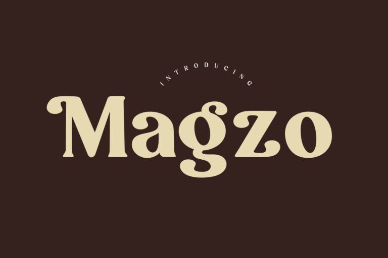
The sharp contrast and aggressive terminals demand instant attention, so you should save this one for front-page breaking news and urgent headlines.
5. Chales Rientta

Artistic ligatures and fashionable curves give this font a boutique feel, yet it remains legible enough for fashion editorials or luxury brand news.
Also Read: 20 Top Fonts for Web to Improve Your Site’s Look and UX
6. Belgia

This is a perfect font for newspapers that radiates corporate stability and formal logic, because of which it has become a standard for financial news and complex market analysis.
7. Salieta

Its graceful curves guide the reader’s eye with a natural cadence, and that makes it a sophisticated choice for editorial opinions and intellectual guest essays.
8. Herkey

It is built to be sturdy and resilient while maintaining its punchy clarity in sports headlines and fast-paced local news coverage.
9. Misteri
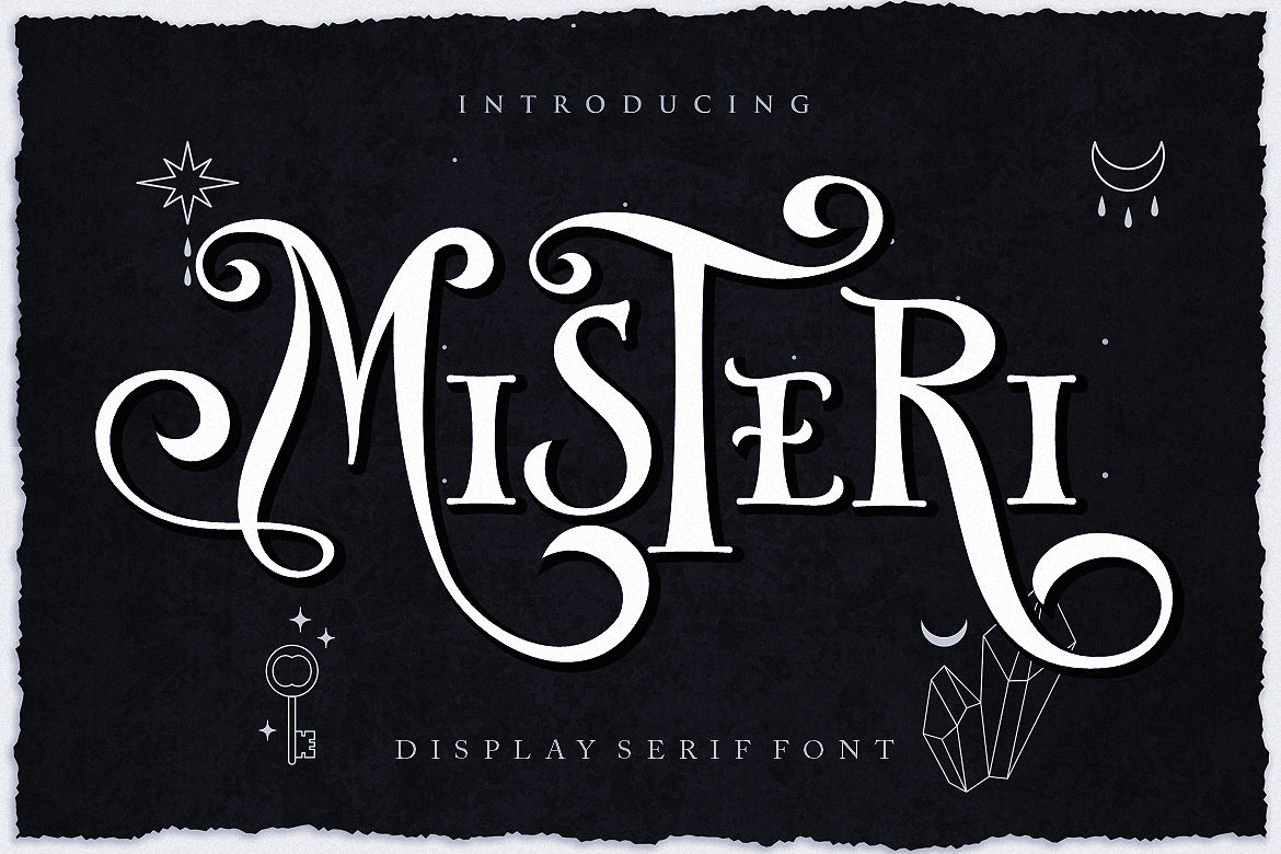
The subtle, intriguing geometry creates a sense of suspense, but it still works brilliantly for investigative crime series or late-night mystery segments.
10. Inktype

By mimicking the raw feel of a traditional printing press, this font adds an artisanal touch to “Letters to the Editor” and nostalgic retrospectives.
Also Read: 21 Best Handwriting Font Selections and How to Choose the Right One
11. Soora Chenival

Since it is engineered for maximum clarity at tiny point sizes, this clean serif is the ultimate workhorse for dense body text and informational sidebars.
12. Vailery

Its slender profile allows for high word counts in tight spaces, but it never loses its grace in narrow vertical columns and news briefs.
13. Boldern

The heavy and unapologetic weight projects massive editorial confidence, and it is best utilized for primary mastheads or powerful front-page titles.
14. Romla

You’ll find a harmonious bridge between classical roots and modern readability, as it is the go-to for standard daily reporting and political updates.
15. Megarin

It strips away unnecessary flourishes to focus on raw information, because of which it is the ideal candidate for international news and data-heavy reports.
Also Read: The Best Font for a Logo: 20 Top Picks for Any Brand
Make Headlines Stronger with the Right Font for Newspapers
Choosing the right font for newspapers is the ultimate way to define your brand’s voice and stand out from the competition. However, professional storytelling also requires professional protection.
To ensure your publication can grow without limits, investing in a worldwide corporate license from HansCo Studio provides the legal and creative freedom your brand deserves.
This strategic investment covers everything from apps and servers to global broadcasting, ensuring your visual identity remains consistent across every platform. Elevate your visual storytelling and secure your publication’s future with our professional font collection!