
Canva Background Texture Ideas for Printable and Editorial Designs
A clean layout can look beautiful on screen and still feel a little flat. Sometimes the missing ingredient isn’t another illustration, a brighter color, or a more decorative font. It’s a barely noticeable texture.
Think of the gentle fibers in handmade paper, the fine weave of linen, or the imperfect ink on a small independent magazine. Those details suggest how a design might feel if you could pick it up.
That’s what I like about using a Canva background texture. It can give a printable or editorial design a sense of material without making the page busy. The trick is choosing a texture that supports the message—and knowing when to stop.
In this guide, I’ll show you how to add textures in Canva, seven combinations worth trying, and how to keep your design readable and print-friendly.
What Is a Canva Background Texture?
A Canva background texture is a photo, graphic, pattern, or uploaded image that adds visible surface detail to a page. Unlike a plain background color, it can suggest paper fibers, fabric, ink grain, paint, or another material.
You can use a texture across the whole page, inside a colored section, or only behind a headline. It doesn’t have to be obvious. In fact, for most printable designs, I find that the quietest textures work best.
The distinction I keep in mind is simple: a pattern wants to be noticed; a background texture helps everything else feel intentional. A bold checkerboard can be a great graphic pattern, but it isn’t a substitute for subtle paper grain behind small editorial text.
How to Add a Background Texture in Canva
You don’t need a complicated effect or a premade template. I usually build the background in layers, because it gives me more control over the color and strength of the texture.
Step 1: Start with the final design size
Open Canva and create your document at the size you actually need. That might be a 5 × 7-inch invitation, an A4 printable, a US Letter worksheet, or a magazine-style page.
It’s easier to judge grain size and texture density when the dimensions are correct from the beginning. A tiny grain that looks lovely on a social post may appear too large on a printed card.
Step 2: Choose a base color first
Set a solid background color before adding any texture. For a warm editorial look, I often begin with ivory, pale sand, soft gray, or muted sage instead of pure white.
Try these combinations as a starting point:
- Warm ivory (
#F5F2EF) with soft gray paper grain. - Off-white (
#FBFBF9) with a faint taupe linen texture. - Light stone (
#EEEFED) with tiny charcoal speckles.
These are creative suggestions, not fixed color rules. The right color depends on the mood and the text above it.
Step 3: Search for a texture in Elements
In Canva’s Elements panel, search for terms such as paper grain, handmade paper texture, linen texture, subtle speckle, watercolor wash, risograph texture, or photocopy texture.
Check both graphics and photos. Some are transparent overlays; others are rectangular images with their own background color. A transparent overlay is often easier to combine with a custom base color.
You can also use your own photograph or scan. Upload a real paper sample, for example, if you want a more personal surface than a stock graphic.
Step 4: Place the texture behind your content
Stretch the texture to cover the area you want, then use Position to send it behind your text and illustrations. If it needs to fill the entire page, Canva also lets you set an image as the page background. I prefer keeping it as a separate layer when I want to adjust its transparency independently.
Canva explains the image-background option in its official background guide.
Step 5: Lower the transparency
Select the texture, open Transparency from the toolbar, and reduce it until the page feels calmer. For a dark texture over a light page, I might test a low opacity around 8–20%, then judge it by eye. That’s not a universal setting: pale textures and different blend colors behave differently.
Don’t force the texture to be visible at every zoom level. If it becomes distracting behind the body copy, reduce it further or leave the text area clean. Canva’s transparency instructions explain how the control works.
Step 6: Add type, then check the hierarchy
Now place your headline, subheading, body text, and small details. I like to start with a display serif or expressive headline and pair it with a restrained sans serif for small text.
If you’re using your own typeface, my guide to uploading fonts to Canva walks through the Brand Kit process and common font issues.
Zoom out until you can see the whole page. The first thing your eye catches should still be the message—not the texture.
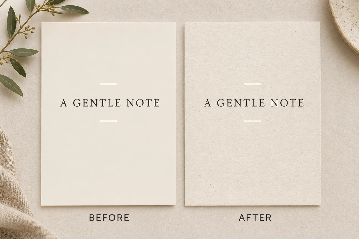
7 Canva Background Texture Ideas That Feel Designed, Not Decorated
Instead of asking, “Which texture looks prettiest?”, I ask, “What material would make sense for this design?” That small change in perspective makes texture choices much more useful.
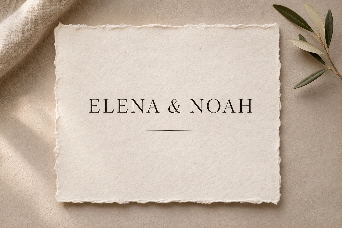
1. Handmade paper grain for quiet, elegant printables
Best for: wedding invitations, thank-you cards, poetry prints, stationery, and minimalist wall art.
Search Canva for handmade paper, paper fibers, or fine paper grain. Pair a warm, almost-white base with a barely visible gray-beige texture. Let the grain do the subtle work while your typography provides the contrast.
For a wedding invitation, I would keep the names large, leave generous margins, and place fine grain across the page. I wouldn’t add several floral illustrations just to make the background feel fuller. The paper character is already doing that job.
Try this: Compare the same invitation with and without the grain. If the textured version feels more tactile but the names are just as easy to read, you’ve found the right balance.
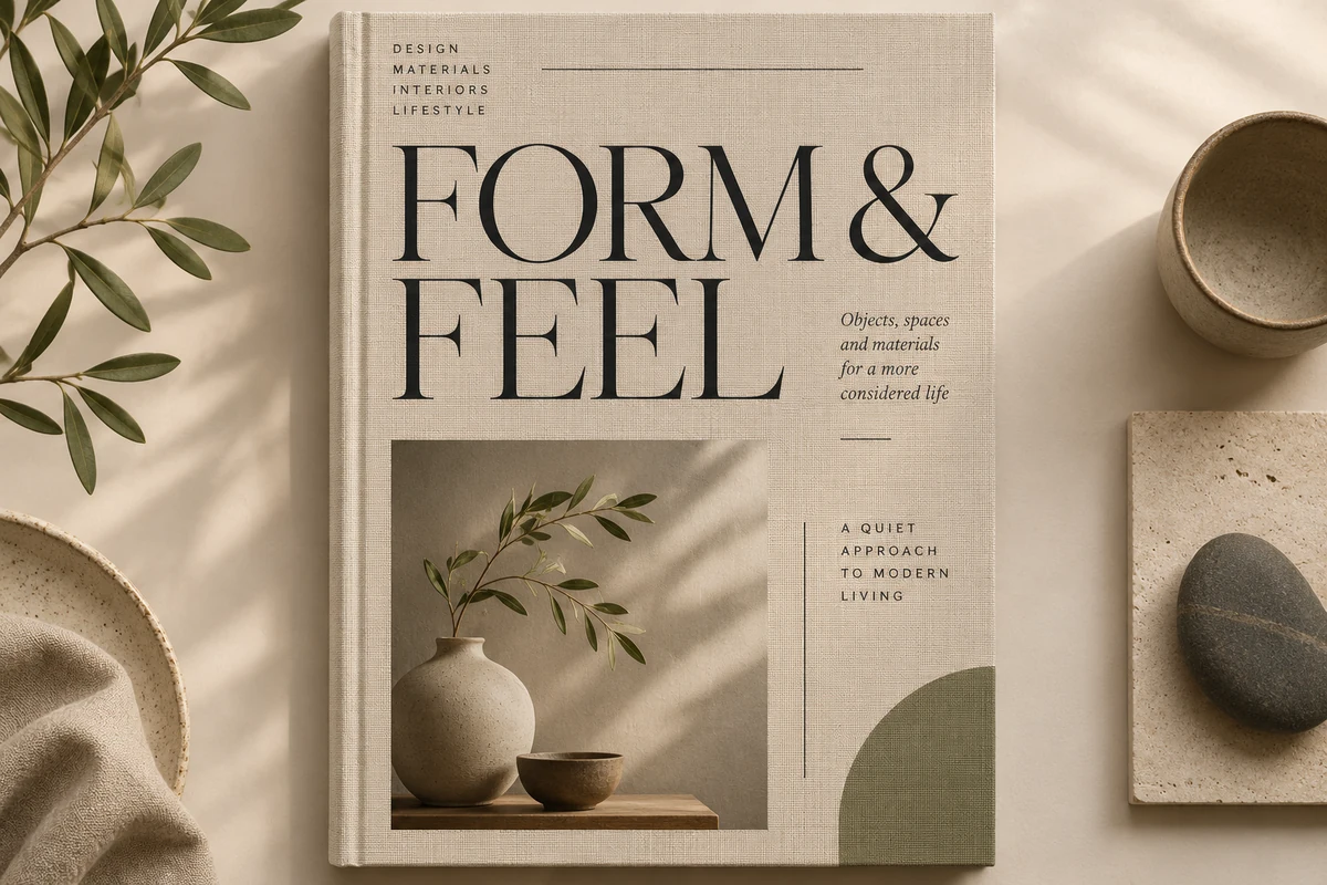
2. Linen texture for refined editorial layouts
Best for: lookbooks, portfolio covers, branding presentations, product catalogs, and editorial title pages.
Search for linen texture, fabric weave, or cotton texture. A faint vertical or crosswoven surface can make a flat color feel more like a book cover or fabric-bound journal.
I especially like linen with a large serif headline, small uppercase captions, and an asymmetric grid. Keep the weave subtle: strong fabric lines behind small text can create unwanted visual noise.
For multi-page work, consider using the linen only on section openers. Interior pages can stay clean so the reader gets a little visual pause between richer spreads.
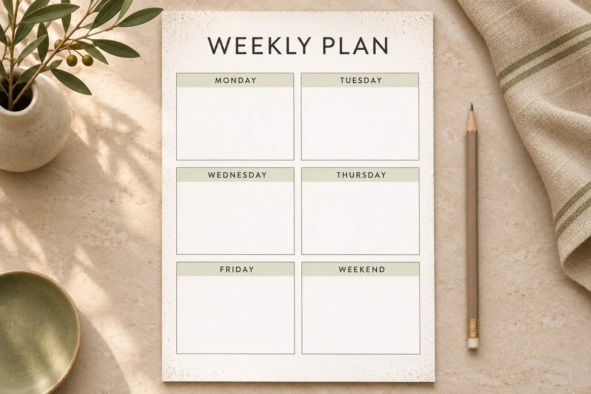
3. Tiny speckles for planners and everyday stationery
Best for: printable planners, habit trackers, note cards, gift tags, and simple product inserts.
Search for fine speckles, subtle dots, or dust texture. Small irregular marks can make everyday stationery feel less sterile without competing with boxes, lines, and handwriting spaces.
The important detail here is placement. On a weekly planner, I would keep speckles in the header, margins, or outer corners—not underneath the areas where someone needs to write with a pen.
This is also one of my favorite ways to make a coordinated printable set. Use the same tiny texture on a planner cover, matching checklist, and note page, but change the amount of texture according to each page’s purpose.
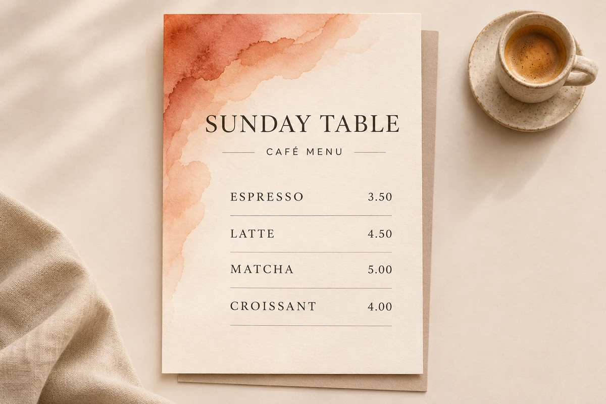
4. Watercolor wash for soft color without a heavy block
Best for: botanical invitations, small business menus, recipe cards, and gentle lifestyle branding.
Search for watercolor wash, watercolor paper, or abstract watercolor. Choose a wash that fades naturally toward the edges rather than a dramatic splash in the middle of the reading area.
For a café menu, for example, I would place a muted terracotta wash in one corner and keep the menu items on a clean cream background. That feels more editorial than covering the entire page with multiple watercolor strokes.
Watercolor can be unpredictable after printing. Very pale edges may disappear, while stronger areas can look darker than they do on screen. A test print is worth the extra minute.
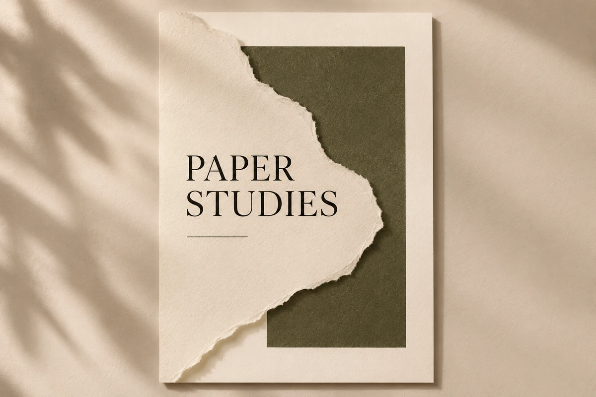
5. Torn-paper edges for collage-style editorial pages
Best for: scrapbook-style posters, creative portfolios, mood boards, event flyers, and artistic newsletters.
Search for torn paper, ripped paper edge, or paper cutout. Here, texture becomes a deliberate shape rather than an all-over layer.
My favorite approach is to limit the composition to two paper surfaces: one full-page base and one torn sheet behind a headline or photo. Vary their tones slightly so the overlap reads clearly. You can add a restrained shadow if the collage needs depth, but it shouldn’t look like a stack of floating stickers.
The torn edge gives the layout personality. The grid, alignment, and typography keep it professional.
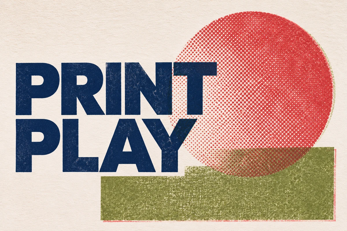
6. Risograph grain and halftone for modern indie print
Best for: zines, record-inspired posters, creative event invitations, and experimental editorial covers.
Search for risograph grain, halftone dots, or print grain. Unlike delicate paper texture, this is supposed to feel more graphic. Use it confidently, but give it a specific job.
For instance, put a halftone circle behind the main headline, or apply grain to a large colored panel. Avoid laying a dense halftone pattern behind paragraphs. The effect should provide rhythm and contrast, not make readers work harder.
A limited palette—perhaps dusty red, navy, and warm paper—often makes the print-inspired mood more convincing than adding five saturated colors.
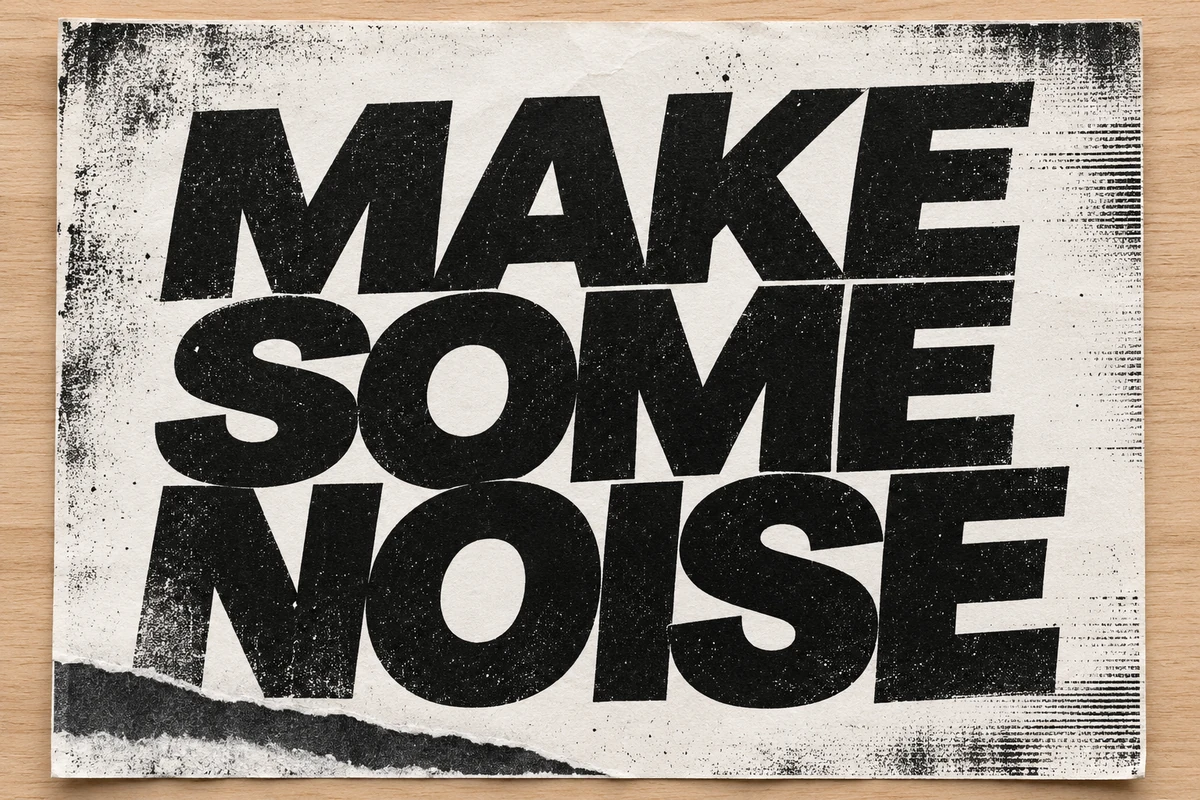
7. Photocopy texture for expressive type-led posters
Best for: typography experiments, workshop posters, music flyers, and bold editorial graphics.
Search for photocopy grain, xerox texture, or distressed print. These textures tend to feel rougher, darker, and more imperfect.
I wouldn’t use this treatment for a detailed price list or a wedding RSVP card. But on a poster with just a few words, it can be wonderfully expressive. Let the headline carry the message and confine the distressed marks to a border, image block, or large letterform area.
This is a good example of how the same tool can create very different visual moods. Texture doesn’t automatically mean vintage; scale, color, and typography decide whether the result feels nostalgic, contemporary, or experimental.
Match the Texture to the Job
When I’m unsure which direction to take, I use the design’s purpose as the deciding factor.
| Project | Texture to try | Where to place it | What to avoid |
|---|---|---|---|
| Wedding invitation | Handmade paper grain | Full page, very subtle | Strong marks behind names and details |
| Editorial cover | Linen or cotton weave | Cover or section opener | Heavy weave under small captions |
| Printable planner | Tiny speckles | Margins and header | Texture inside writing boxes |
| Café menu | Soft watercolor wash | One edge or corner | Wash behind prices and descriptions |
| Creative poster | Halftone or photocopy grain | Large type or graphic panel | Distressing every element equally |
| Portfolio mood board | Torn-paper cutout | Behind one focal image or title | Too many overlapping paper pieces |
There’s no rule that a project needs just one texture. But if you combine two, give each a different role. One might establish the paper surface; the other might emphasize a single focal point.
How to Keep Canva Textures Print-Friendly
A texture can look subtle at 125% zoom and turn into a muddy gray layer on paper. This is where a little restraint saves both the design and your ink.
Protect the reading areas
Body text, small dates, prices, QR codes, and handwriting spaces need a calm background. If you love a textured page, place a solid or nearly solid panel behind the important information.
Check resolution at the final physical size
Don’t stretch a small, blurry texture over a large poster and assume a high-quality export will repair it. Fine grain can become pixelated, especially on edges and diagonal marks. Use a suitably high-resolution image for the final print dimensions and inspect a downloaded sample at 100% size.
Decide whether you actually need full bleed
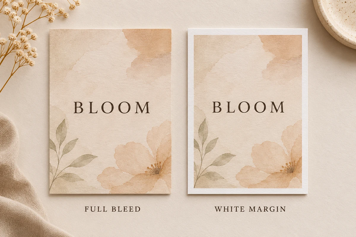
If the texture reaches the edge of a professionally trimmed card, extend it into the printer’s required bleed area. If you’re making a home-printable worksheet, a deliberate white margin is often easier and more reliable than an edge-to-edge background.
Export with the intended use in mind
For printing, Canva offers PDF Print, including print-oriented resolution and options for bleed and crop marks. For digital sharing, a smaller PDF or image format may make more sense. Canva explains the differences in its file type guide.
I also recommend my Canva PDF Print settings tutorial if you’re preparing products for customers or a commercial print shop.
Print one small sample
My final check is simple: print the page at its intended size. Look for muddy grain, weak contrast, visible image pixels, and areas where the paper itself becomes harder to read or write on. If the texture is consuming a lot of ink without adding much character, dial it back.
Common Canva Background Texture Mistakes
Here are a few things I would avoid even when the texture itself is beautiful:
- Using texture at full strength. Many stock assets are made to be noticed in search results, not to sit quietly behind a page of text.
- Layering multiple busy effects. Paper grain, a distressed border, watercolor, and halftone can each be lovely. Together, they can cancel out the hierarchy.
- Ignoring the intended paper. An off-white digital background printed on cream cardstock may become much warmer than expected. The physical paper is part of the design.
- Decorating functional areas. A textured notebook cover can be expressive; its lined writing pages should remain easy to use.
- Forgetting asset rights. Check the licensing terms of any third-party texture, particularly if you’re selling templates or distributing editable files. A texture being available to view does not automatically make it free to redistribute.
Frequently Asked Questions
Can I use a Canva background texture for free?
Yes. Canva includes free design assets, although some textures are marked as premium. You can also upload a texture you created yourself or have permission to use. Check the asset’s availability and license in your account before publishing or selling the final design.
How do I make a background texture lighter in Canva?
Select the texture layer, open the Transparency control, and lower its opacity. If the image is already set as the page background and the control isn’t convenient, try keeping it as a separate full-page image layer so you can adjust it more easily.
Which Canva texture is best for printable invitations?
For a classic invitation, I would start with subtle handmade paper grain or a faint linen texture. For a more romantic direction, use a controlled watercolor wash in a corner. Keep the names, date, and venue details clear.
Can I upload my own paper texture to Canva?
Yes. Photograph or scan a paper sample in even light, crop and clean it, then upload the image into Canva. A real material scan can make a repeatable invitation set or editorial series feel more distinctive. Make sure the file has enough detail for the final size.
Will a Canva background texture look the same when printed?
Not exactly. Paper color, printer settings, ink, and the texture image all affect the result. A texture that looks delicate on your monitor may print darker, lighter, or less sharp. Always test the export if the finished piece matters.
Final Thoughts: Let the Texture Whisper
The most useful Canva background texture isn’t necessarily the one with the most detail. It’s the one that makes the design feel like it belongs on a particular material, for a particular audience, without stealing attention from the words.
I like to begin with a clean layout, add one texture, and then remove anything that no longer earns its place. A hint of paper grain can be enough for a wedding card. A controlled halftone can give a poster its energy. A linen cover can make an editorial PDF feel like a small printed publication.
If you want to keep building that kind of thoughtful, type-led work, explore my Canva & Design Tutorials for more practical design ideas.